CIA At Home in Crocker Park

Gallery W, installation view
For those with a soft spot for the 78th Street Studios , which once was home to American Greetings’ Creative Studios, it’s a particular treat to see “Creative Studios” splashed across the swanky new Crocker Park storefront of Gallery W. And crazier still is to see two of Lane Cooper’s works in the window, familiar faces welcoming the public into the formerly corporate space.
Visitors are ushered into the American Greetings complex via easy parking, adequate signage and good design. One foot out of the parking deck, and it’s obvious that Gallery W (so named for the Weiss family, owners and descendants of American Greetings’ founders) is right in front of you.
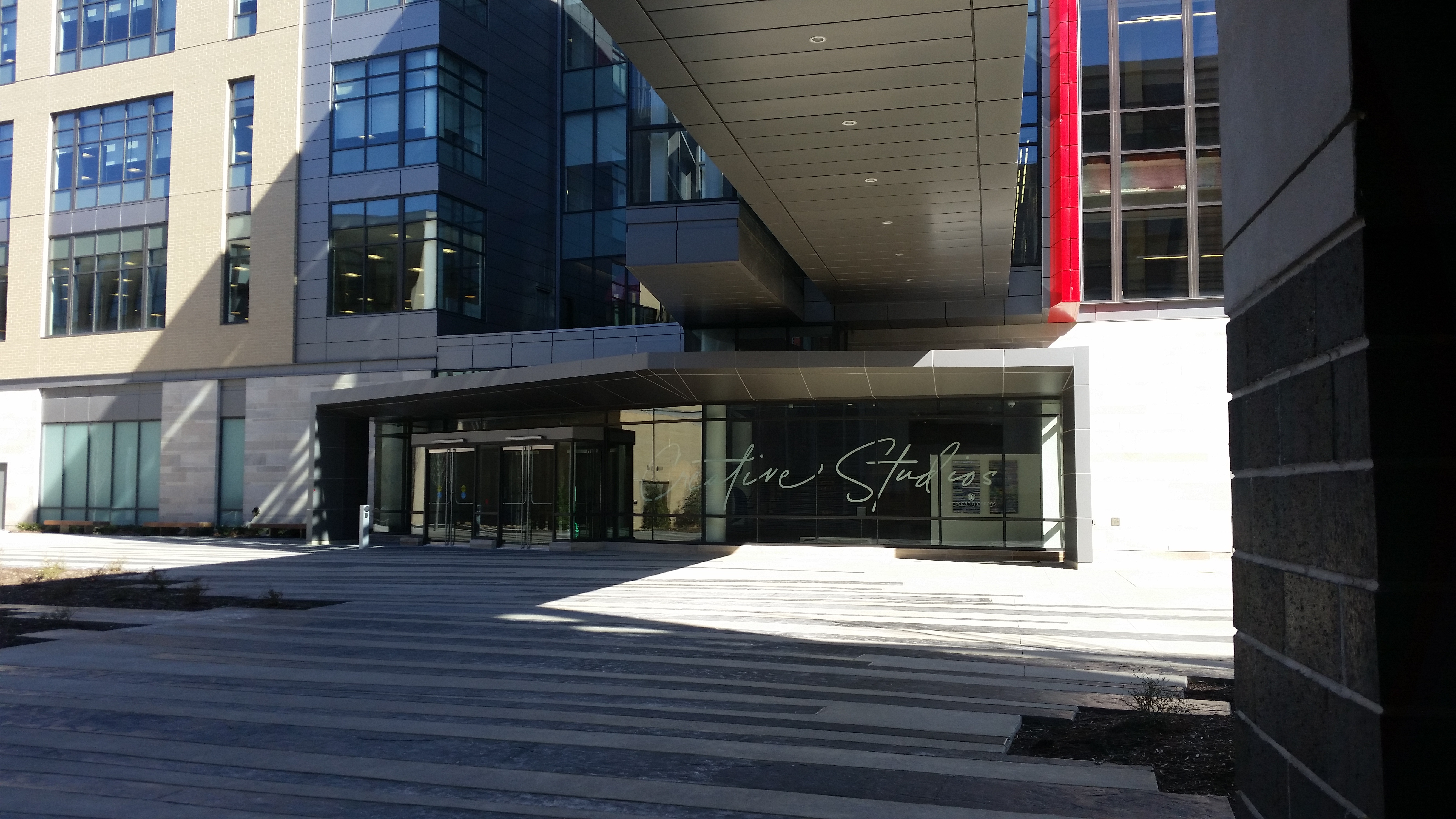
Gallery W entrance
On view now is Divergent Explorations, featuring the work of five Cleveland Institute of Art faculty and alumni: Lane Cooper, a painting professor whose works feature an evolving matrix of stripes shrouding hazy figures and a distinct blue I’ve come to think of as Cooper blue; Dan Tranberg, professor and local living proof you can be a great writer AND a great artist; Ben Grasso, an alumnus whose exploded quotidian scenes present the viewer with a note of “plastic anxiety,” but the sheer beauty of his brushstrokes allows you to let go of that anxiety pretty readily; Tony Ingrisano, a painting and foundations professor and maverick of drawing over his own collaged textures smoothly; and Scott Stibich, a sculpture and installation alumnus whose work is playful and immediate. Gallery W opened last fall with a show of work by artists of Zygote Press, but for American Greetings to have a gallery open to the public and dedicated to exhibiting work by non-employees is still new, and signals a desire to truly welcome in guests from outside the organization.
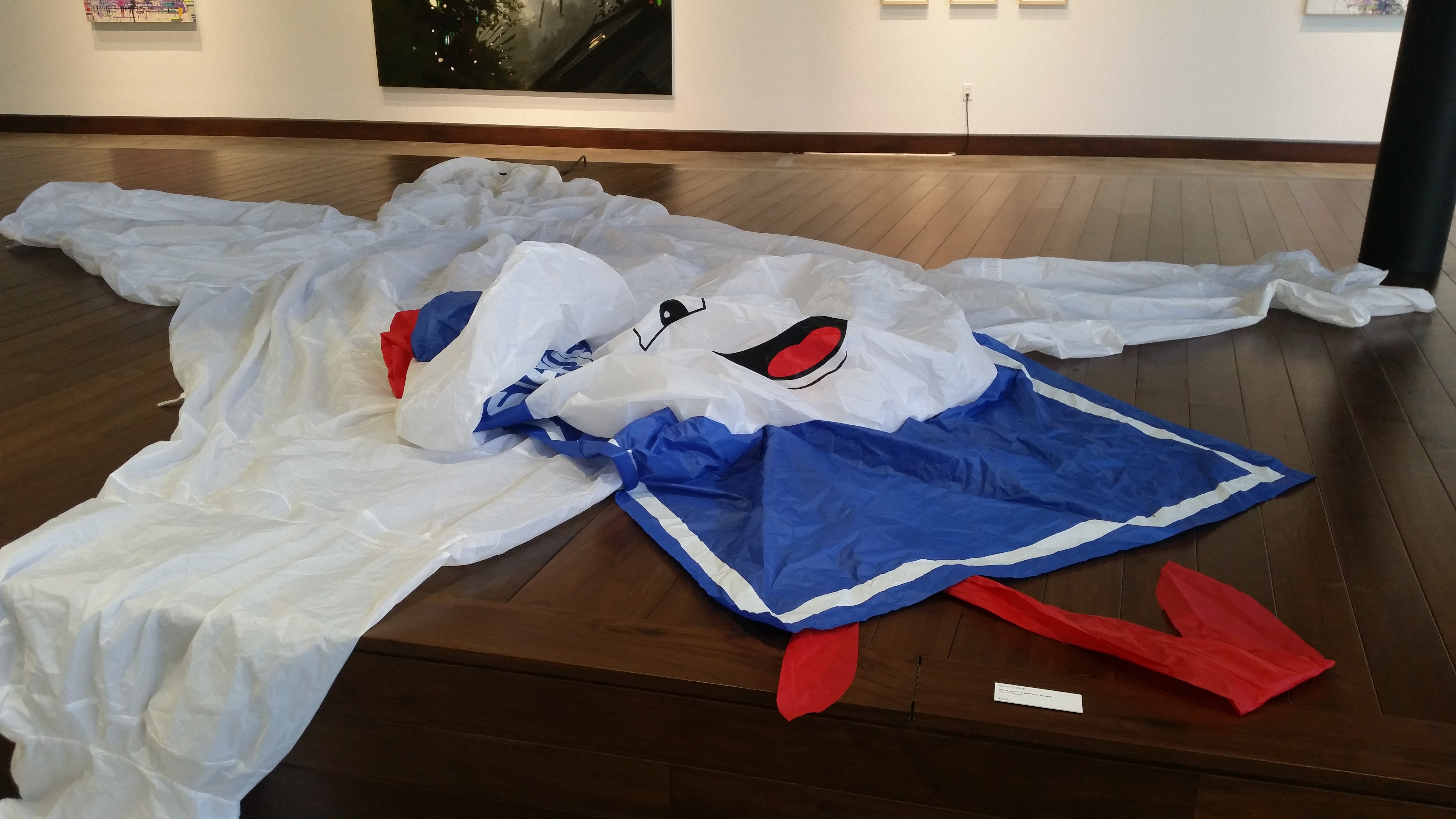
StayPuft, by Scott Stibich
Inside Gallery W you’re greeted by Scott Stibich’s work, the neon suggestion of a sign or mirror framing a decaying bouquet which makes me think of my grandmothers and also makes me feel vaguely in the mood to buy something. But the star here is a massive inflatable draped over the central, stage-like area which did not Stay Puft. There’s something delicious about seeing a commercial icon so proudly deflated in a corporate lobby.

Tony Ingrisano
Stibich’s work is the most divergent: the pieces of the other four artists converge into a dialogue about shared palettes and line. Tony Ingrisano’s work employs subtly collaged strips of watercolors to form DNA sequences in his backgrounds that echo Cooper’s matrix. This elegant texture seems like an impossible surface on which to keep a steady hand. But Ingrisano manages to rest his architectural subjects as cleanly on these spliced surfaces as they would be on an uncut sheet of paper. His foregrounds of floating floorplans and unwieldy piles of pick up sticks feel, in the context of this show, like an isolation of Grasso’s forms and a meditation in a similar headspace.

Ben Grasso, Inside Out
Ben Grasso’s Inside Out shows two iconically Cleveland-style houses either being blown to smithereens or reforming spontaneously. It’s hard to look away from the aggressively frozen moment. Colored Lights similarly feels cinematic, and although I’m not sure if the elements of domesticity are attacking me or if I’m somehow psychically attacking them, the transcendent brush work convinces me that in the scope of eternity, it’s really all the same.
The tidy, meticulous work of all five artists is set off nicely by the new, sharp, clean walls. Even the unusual choice to create movable walls that are actually wheeled drywall sheds works with this show as if they were built specifically to mimic Grasso’s exploded residential scenes.

It’s A Wonderful, Lane Cooper
Cooper’s new work is full of surprising textures, colors, and line. Figures have begun emerging in her pieces like fuzz clearing on a TV over the past several years, and that evolution is continuing. Female faces, most notably Mary Tyler Moore, are given a modern update with lurid highlighter tones. But in It’s a Wonderful Life – Filigree, Cooper’s stripes have begun marching into an entirely new direction: exuberant streaks and flourishes of neon meet textural globs, splatters, and drips. It’s a Wonderful Life is threatening to peel off the canvas like Colorforms and dance away. It’s a fascinating departure.
Tranberg’s exquisite color studies round out the group, providing a Platonian vision of the palette the whole group is employing. His works are all precision and restraint. Smooth, measured, miniature fields of pure color invite you to think about each color’s relationship to the the one around it. They’re cool, calm, and collected; tried and true. They’d make imminently frameable greeting cards.

Installation view
Divergent Explorations is on view at Gallery W, 1 American Blvd in Westlake, through April 28th.

You must be logged in to post a comment.